frompylabimport*
fromsklearn.clusterimportKMeans
## 利用
numpy.append()函数实现matlab多维数组合并的效果,axis 参数值为 0 时是 y 轴方向合并,参数值为 1 时是 x 轴方向合并,分别对应matlab [A ; B] 和 [A , B]的效果
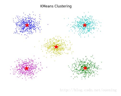
#创建5个随机的数据集
x1=append(randn(500,1)+5,randn(500,1)+5,axis=1)
x2=append(randn(500,1)+5,randn(500,1)-5,axis=1)
x3=append(randn(500,1)-5,randn(500,1)+5,axis=1)
x4=append(randn(500,1)-5,randn(500,1)-5,axis=1)
x5=append(randn(500,1),randn(500,1),axis=1)
# 下面用较笨的方法把5个数据集合并成 (2500,2)大小的数组data
data=append(x1,x2,axis=0)
data=append(data,x3,axis=0)
data=append(data,x4,axis=0)
data=append(data,x5,axis=0)
plot(x1[:,0],x1[:,1],'oc',markersize=0.8)
plot(x2[:,0],x2[:,1],'og',markersize=0.8)
plot(x3[:,0],x3[:,1],'ob',markersize=0.8)
plot(x4[:,0],x4[:,1],'om',markersize=0.8)
plot(x5[:,0],x5[:,1],'oy',markersize=0.8)
k=KMeans(n_clusters=5,random_state=0).fit(data)
t=k.cluster_centers_# 获取数据中心点
plot(t[:,0],t[:,1],'r*',markersize=16)# 显示这5个中心点,五角星标记~
title('KMeans Clustering')
box(False)
xticks([]) # 去掉坐标轴的标记
yticks([])
show()
importplotly.plotly as py
importplotly.graph_objs as go
importplotly
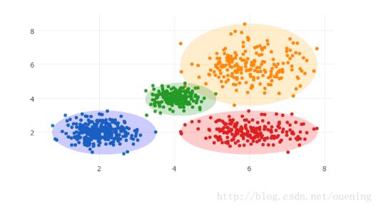
#生成三组高斯分布(Gaussian Distribution)点集
x0=np.random.normal(2,0.45,300)
y0=np.random.normal(2,0.45,300)
x1=np.random.normal(6,0.8,200)
y1=np.random.normal(6,0.8,200)
x2=np.random.normal(4,0.3,200)
y2=np.random.normal(4,0.3,200)
#创建图形对象 graph object
trace0=go.Scatter(
x=x0,
y=y0,
mode='markers',
)
trace1=go.Scatter(
x=x1,
y=y1,
mode='markers'
)
trace2=go.Scatter(
x=x2,
y=y2,
mode='markers'
)
trace3=go.Scatter(
x=x1,
y=y0,
mode='markers'
)
#布局是一个字典,字典关键字keys包括:'shapes', 'showlegend'
layout={
'shapes': [
{
'type':'circle',
'xref':'x',
'yref':'y',
'x0':min(x0),
'y0':min(y0),
'x1':max(x0),
'y1':max(y0),
'opacity':0.2,
'fillcolor':'blue',
'line': {
'color':'blue',
},
},
{
'type':'circle',
'xref':'x',
'yref':'y',
'x0':min(x1),
'y0':min(y1),
'x1':max(x1),
'y1':max(y1),
'opacity':0.2,
'fillcolor':'orange',
'line': {
'color':'orange',
},
},
{
'type':'circle',
'xref':'x',
'yref':'y',
'x0':min(x2),
'y0':min(y2),
'x1':max(x2),
'y1':max(y2),
'opacity':0.2,
'fillcolor':'green',
'line': {
'color':'green',
},
},
{
'type':'circle',
'xref':'x',
'yref':'y',
'x0':min(x1),
'y0':min(y0),
'x1':max(x1),
'y1':max(y0),
'opacity':0.2,
'fillcolor':'red',
'line': {
'color':'red',
},
},
],
'showlegend':False,
}
data=[trace0, trace1, trace2, trace3]
#图像包括数据部分和布局部分
fig={
'data': data,
'layout': layout,
}
#使用离线的方式绘制图像,因为没有注册官方的网站,而且那个网站不容易进去,所以用离线绘制
plotly.offline.plot(fig, filename='clusters')


 京公网安备 11010802034615号
经营许可证编号:京B2-20210330
京公网安备 11010802034615号
经营许可证编号:京B2-20210330