python具有强大的可视化功能,能够绘制出许多效果酷炫的图表,小编今天跟大家分享的是:如何用python绘制折线图。
以下文章转载于大数据DT微信公众号。
作者:屈希峰,资深Python工程师,知乎多个专栏作者
来源:大数据DT(ID:hzdashuju)
内容摘编自《Python数据可视化:基于Bokeh的可视化绘图》
导读:数据分析时经常用到的折线图,你真的懂了吗?可以用来呈现哪些数据关系?在数据分析过程中可以解决哪些问题?怎样用Python绘制折线图?本文逐一为你解答。

01 概述
折线图(Line)是将排列在工作表的列或行中的数据进行绘制后形成的线状图形。折线图可以显示随时间(根据常用比例设置)而变化的连续数据,非常适用于显示在相等时间间隔下数据的趋势。
在折线图中,数据是递增还是递减、增减的速率、增减的规律(周期性、螺旋性等)、峰值等特征都可以清晰地反映出来。所以,折线图常用来分析数据随时间的变化趋势,也可用来分析多组数据随时间变化的相互作用和相互影响。
例如,可用来分析某类商品或是某几类相关的商品随时间变化的销售情况,从而进一步预测未来的销售情况。在折线图中,一般水平轴(x轴)用来表示时间的推移,并且间隔相同;而垂直轴(y轴)代表不同时刻的数据的大小。如图0所示。

▲图0 折线图
02 实例
折线图代码示例如下所示。
代码示例①
1# 数据
2x = [1. 2. 3. 4. 5. 6. 7]
3y = [6. 7. 2. 4. 5. 10. 4]
4# 画布:坐标轴标签,画布大小
5p = figure(title="line example", x_axis_label='x', y_axis_label='y', width=400. height=400)
6# 绘图:数据、图例、线宽
7p.line(x, y, legend="Temp.", line_width=2) # 折线
8# 显示
9show(p)
运行结果如图1所示。
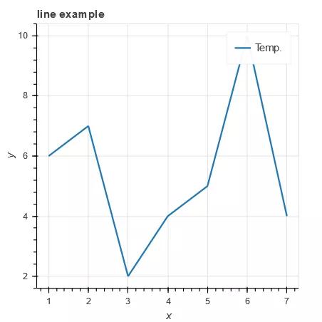
▲图1 代码示例①运行结果
代码示例①仍以最简单的方式绘制第一张折线图。line()方法的参数说明如下。
p.line(x, y, **kwargs)参数说明
x (:class:`~bokeh.core.properties.NumberSpec` ) : x坐标。
y (:class:`~bokeh.core.properties.NumberSpec` ) : y坐标。
line_alpha (:class:`~bokeh.core.properties.NumberSpec` ) : (default: 1.0) 轮廓线透明度。
line_cap ( :class:`~bokeh.core.enums.LineCap` ) : (default: 'butt') 线端。
line_color (:class:`~bokeh.core.properties.ColorSpec` ) : (default: 'black') 轮廓线颜色,默认:黑色。
line_dash (:class:`~bokeh.core.properties.DashPattern` ) : (default: []) 虚线,类型可以是序列,也可以是字符串('solid', 'dashed', 'dotted', 'dotdash', 'dashdot')。
line_dash_offset (:class:`~bokeh.core.properties.Int` ) : (default: 0) 虚线偏移。
line_join(:class:`~bokeh.core.enums.LineJoin` ) : (default: 'bevel')。
line_width(:class:`~bokeh.core.properties.NumberSpec` ) : (default: 1) 线宽。
name (:class:`~bokeh.core.properties.String` ) : 图元名称。
tags (:class:`~bokeh.core.properties.Any` ) :图元标签。
alpha (float) : 一次性设置所有线条的透明度。
color (Color) : 一次性设置所有线条的颜色。
source (ColumnDataSource) : Bokeh特有数据格式(类似于Pandas Dataframe)。
legend (str) : 图元的图例。
x_range_name (str) : x轴范围名称。
y_range_name (str) : y轴范围名称。
level (Enum) : 图元渲染级别。
代码示例②
1p = figure(plot_width=400. plot_height=400)
2# 线段x、y位置点均为列表;两段线的颜色、透明度、线宽
3p.multi_line([[1. 3. 2], [3. 4. 6. 6]], [[2. 1. 4], [4. 7. 8. 5]],
4color=["firebrick", "navy"], alpha=[0.8. 0.3], line_width=4) # 多条折(曲)线
5show(p)
运行结果如图2所示。
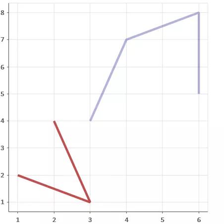
▲图2 代码示例②运行结果
代码示例②第3行使用multi_line()方法,实现一次性绘制两条折线,同时,在参数中定义不同折线的颜色。如果使用Pandas Dataframe,则可以同时绘制不同列的数据。multi_line()方法的参数说明如下。
p.multi_line(xs, ys, **kwargs)参数说明
xs (:class:`~bokeh.core.properties.NumberSpec` ) :x坐标,列表。
ys (:class:`~bokeh.core.properties.NumberSpec` ) :y坐标,列表。
其他参数同line。
代码示例③
1# 准备数据
2x = [0.1. 0.5. 1.0. 1.5. 2.0. 2.5. 3.0]
3y0 = [i**2 for i in x]
4y1 = [10**i for i in x]
5y2 = [10**(i**2) for i in x]
6# 创建画布
7p = figure(
8 tools="pan,box_zoom,reset,save",
9 y_axis_type="log", title="log axis example",
10 x_axis_label='sections', y_axis_label='particles',
11 width=700. height=350)
12# 增加图层,绘图
13p.line(x, x, legend="y=x")
14p.circle(x, x, legend="y=x", fill_color="white", size=8)
15p.line(x, y0. legend="y=x^2", line_width=3)
16p.line(x, y1. legend="y=10^x", line_color="red")
17p.circle(x, y1. legend="y=10^x", fill_color="red", line_color="red", size=6)
18p.line(x, y2. legend="y=10^x^2", line_color="orange", line_dash="4 4")
19# 显示
20show(p)
运行结果如图3所示。
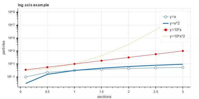
▲图3 代码示例③运行结果
代码示例③第13、15、16行使用line()方法逐一绘制折线,该方法的优点是基本数据清晰,可在不同线条绘制过程中直接定义图例。读者也可以使用multi_line()方法一次性绘制三条折线,然后再绘制折线上的数据点。同样,既可以在函数中预定义图例,也可以用Lengend方法单独进行定义,在后会对图例进行详细说明。
代码示例④
1p.legend.location = "top_left" # 图例位于左上
2p.legend.click_policy="hide" # 点击图例显示、隐藏图形
3show(p) # 自行测试效果
运行结果如图4所示。
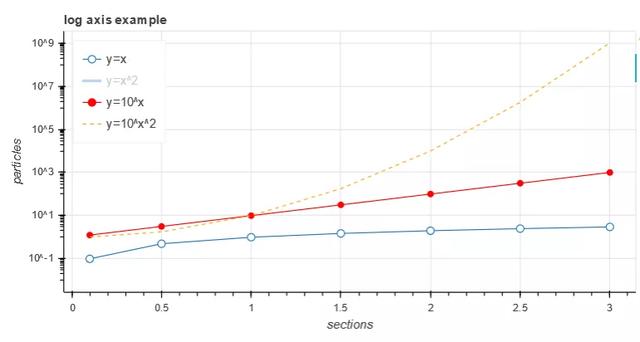
▲图4 代码示例④运行结果
代码示例④在代码示例③的基础上增加了图例的位置、显示或隐藏图形属性;通过点击图例,可实现图形的显示或隐藏,当折线数目较多或者颜色干扰阅读时,可以通过该方法实现对某一条折线数据的重点关注。这种通过图例、工具条、控件实现数据人机交互的可视化方式,正是Bokeh得以在GitHub火热的原因,建议在工作实践中予以借鉴。
代码示例⑤
1# 数据
2import numpy as np
3x = np.linspace(0. 4*np.pi, 200)
4y1 = np.sin(x)
5y2 = np.cos(x)
6# 将y1+—0.9范围外的数据设置为无穷大
7y1[y1>+0.9] = +np.inf
8y1[y1<-0.9] = -np.inf
9# 将y2+—0.9范围外的数据采用掩码数组或NAN值替换
10y2 = np.ma.masked_array(y2. y2<-0.9)
11y2[y2>0.9] = np.nan
12# 图层
13p = figure(title="lines with missing/inf values")
14# 绘图x,y1
15p.line(x, y1. color="firebrick", line_width=2) # 砖红色
16# 绘图x,y2
17p.line(x, y2. color="blue", line_width=2) # 蓝色
18show(p)
运行结果如图5所示。
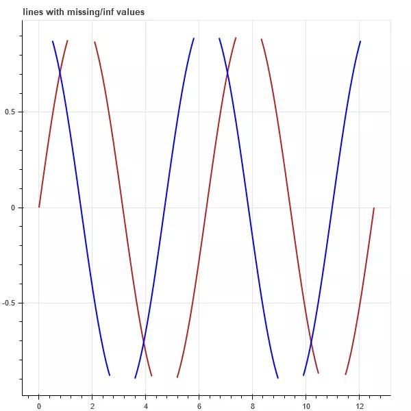
▲图5 代码示例⑤运行结果
代码示例⑤第15、16行使用line()方法绘制两组不同颜色的曲线。
代码示例⑥
1import numpy as np
2from collections import defaultdict
3from scipy.stats import norm
4from bokeh.models import HoverTool, TapTool
5from bokeh.layouts import gridplot
6from bokeh.palettes import Viridis6
7# 数据
8mass_spec = defaultdict(list) #defaultdict类的初始化函数接受一个list类型作为参数,当所访问的键不存在时,可以实例化一个值作为默认值
9RT_x = np.linspace(118. 123. num=50)
10norm_dist = norm(loc=120.4).pdf(RT_x) # loc均值;pdf输入x,返回概率密度函数
11
12# 生成6组高斯分布的曲线
13for scale, mz in [(1.0. 83), (0.9. 55), (0.6. 98), (0.4. 43), (0.2. 39), (0.12. 29)]:
14 mass_spec["RT"].append(RT_x)
15 mass_spec["RT_intensity"].append(norm_dist * scale)
16 mass_spec["MZ"].append([mz, mz])
17 mass_spec["MZ_intensity"].append([0. scale])
18 mass_spec['MZ_tip'].append(mz)
19 mass_spec['Intensity_tip'].append(scale)
20# 线条颜色
21mass_spec['color'] = Viridis6
22# 画布参数
23figure_opts = dict(plot_width=450. plot_height=300)
24hover_opts = dict(
25 tooltips=[('MZ', '@MZ_tip'), ('Rel Intensity', '@Intensity_tip')], # 鼠标悬停在曲线上动态显示数据
26 show_arrow=False,
27 line_policy='next'
28)
29line_opts = dict(
30 line_width=5. line_color='color', line_alpha=0.6.
31 hover_line_color='color', hover_line_alpha=1.0.
32 source=mass_spec # 线条数据
33)
34# 画布1
35rt_plot = figure(tools=[HoverTool(**hover_opts), TapTool()], **figure_opts)
36# 同时绘制多条折(曲)线
37rt_plot.multi_line(xs='RT', ys='RT_intensity', legend="Intensity_tip", **line_opts)
38# x,y轴标签
39rt_plot.xaxis.axis_label = "Retention Time (sec)"
40rt_plot.yaxis.axis_label = "Intensity"
41# 画布2
42mz_plot = figure(tools=[HoverTool(**hover_opts), TapTool()], **figure_opts)
43mz_plot.multi_line(xs='MZ', ys='MZ_intensity', legend="Intensity_tip", **line_opts)
44mz_plot.legend.location = "top_center"
45mz_plot.xaxis.axis_label = "MZ"
46mz_plot.yaxis.axis_label = "Intensity"
47# 显示
48show(gridplot([[rt_plot, mz_plot]]))
运行结果如图6所示。
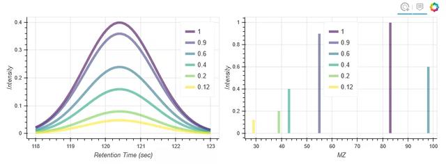
▲图6 代码示例⑥运行结果
代码示例⑥第19行中,生成绘图数据时,同时生成图例名称列表;第37、43行使用multi_line()方法一次性绘制6条曲线,并预定义图例。
代码示例⑦
1import numpy as np
2# 数据
3x = np.linspace(0.1. 5. 80)
4# 画布
5p = figure(title="log axis example", y_axis_type="log",
6 x_range=(0. 5), y_range=(0.001. 10**22),
7 background_fill_color="#fafafa")
8# 绘图
9p.line(x, np.sqrt(x), legend="y=sqrt(x)",
10 line_color="tomato", line_dash="dashed")
11p.line(x, x, legend="y=x")
12p.circle(x, x, legend="y=x")
13p.line(x, x**2. legend="y=x**2")
14p.circle(x, x**2. legend="y=x**2",
15 fill_color=None, line_color="olivedrab")
16p.line(x, 10**x, legend="y=10^x",
17 line_color="gold", line_width=2)
18p.line(x, x**x, legend="y=x^x",
19 line_dash="dotted", line_color="indigo", line_width=2)
20p.line(x, 10**(x**2), legend="y=10^(x^2)",
21 line_color="coral", line_dash="dotdash", line_width=2)
22# 其他
23p.legend.location = "top_left"
24# 显示
25show(p)
运行结果如图7所示。
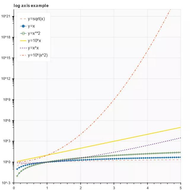
▲图7 代码示例⑦运行结果
代码示例⑦与代码示例③相似,第10、19、21行对曲线的属性进行自定义,注意虚线的几种形式('solid', 'dashed', 'dotted', 'dotdash', 'dashdot'),读者可以自行替换测试。
代码示例⑧
1from bokeh.models import ColumnDataSource, NumeralTickFormatter, SingleIntervalTicker
2from bokeh.sampledata.us_marriages_divorces import data
3# 数据
4data = data.interpolate(method='linear', axis=0).ffill().bfill()
5source = ColumnDataSource(data=dict(
6 year=data.Year.values,
7 marriages=data.Marriages_per_1000.values,
8 divorces=data.Divorces_per_1000.values,
9))
10# 工具条
11TOOLS = 'pan,wheel_zoom,box_zoom,reset,save'
12# 画布
13p = figure(tools=TOOLS, plot_width=800. plot_height=500.
14 tooltips='@$name{0.0} $name per 1.000 people in @year')
15# 其他自定义属性
16p.hover.mode = 'vline'
17p.xaxis.ticker = SingleIntervalTicker(interval=10. num_minor_ticks=0)
18p.yaxis.formatter = NumeralTickFormatter(format='0.0a')
19p.yaxis.axis_label = '# per 1.000 people'
20p.title.text = '144 years of marriage and divorce in the U.S.'
21# 绘图
22p.line('year', 'marriages', color='#1f77b4', line_width=3. source=source, name="marriages")
23p.line('year', 'divorces', color='#ff7f0e', line_width=3. source=source, name="divorces")
24# 显示
25show(p)
运行结果如图8所示。
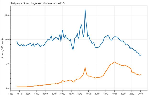
▲图8 代码示例⑧运行结果
代码示例⑧第22、23行通过line()方法绘制两条曲线,严格上讲这两条曲线并不是Bokeh时间序列的标准绘制方法。第17行定义了x轴刻度的间隔以及中间刻度数,读者可以尝试将num_minor_ticks=10的显示效果与图8进行对比;第18行定义了y轴的数据显示格式。
代码示例⑨
1import numpy as np
2from scipy.integrate import odeint
3# 数据
4sigma = 10
5rho = 28
6beta = 8.0/3
7theta = 3 * np.pi / 4
8# 洛伦兹空间向量点生成函数
9def lorenz(xyz, t):
10 x, y, z = xyz
11 x_dot = sigma * (y - x)
12 y_dot = x * rho - x * z - y
13 z_dot = x * y - beta* z
14 return [x_dot, y_dot, z_dot]
15initial = (-10. -7. 35)
16t = np.arange(0. 100. 0.006)
17solution = odeint(lorenz, initial, t)
18x = solution[:, 0]
19y = solution[:, 1]
20z = solution[:, 2]
21xprime = np.cos(theta) * x - np.sin(theta) * y
22# 调色
23colors = ["#C6DBEF", "#9ECAE1", "#6BAED6", "#4292C6", "#2171B5", "#08519C", "#08306B",]
24# 画布
25p = figure(title="Lorenz attractor example", background_fill_color="#fafafa")
26# 绘图 洛伦兹空间向量
27p.multi_line(np.array_split(xprime, 7), np.array_split(z, 7),
28 line_color=colors, line_alpha=0.8. line_width=1.5)
29# 显示
30show(p)
运行结果如图9所示。
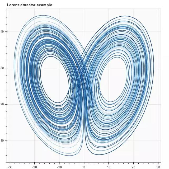
▲图9 代码示例⑨运行结果
代码示例⑨使用multi_line()方法在二维空间展示洛伦兹空间向量,示例中的数据生成稍微有点复杂,可以直观感受可视化之下的数据之美,有兴趣的读者可以深入了解。
代码示例⑩
1import numpy as np
2from bokeh.layouts import row
3from bokeh.palettes import Viridis3
4from bokeh.models import CheckboxGroup, CustomJS
5# 数据
6x = np.linspace(0. 4 * np.pi, 100)
7# 画布
8p = figure()
9# 折线属性
10props = dict(line_width=4. line_alpha=0.7)
11# 绘图
12l0 = p.line(x, np.sin(x), color=Viridis3[0], legend="Line 0", **props)
13l1 = p.line(x, 4 * np.cos(x), color=Viridis3[1], legend="Line 1", **props)
14l2 = p.line(x, np.tan(x), color=Viridis3[2], legend="Line 2", **props)
15# 复选框激活显示
16checkbox = CheckboxGroup(labels=["Line 0", "Line 1", "Line 2"],
17 active=[0. 1. 2], width=100)
18checkbox.callback = CustomJS(args=dict(l0=l0. l1=l1. l2=l2. checkbox=checkbox), code="""
19l0.visible = 0 in checkbox.active;
20l1.visible = 1 in checkbox.active;
21l2.visible = 2 in checkbox.active;
22""")
23# 添加图层
24layout = row(checkbox, p)
25# 显示
26show(layout)
运行结果如图10所示。
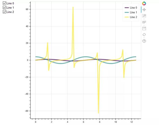
▲图10 代码示例⑩运行结果
代码示例⑩增加了Bokeh控件复选框,第12、13、14行使用line()方法绘制3条曲线;第16行定义复选框,并在18行定义回调函数,通过该回调函数控制3条曲线的可视状态;第24行将复选框、绘图并在一行进行显示。
代码示例⑪
1from bokeh.models import TapTool, CustomJS, ColumnDataSource
2# 数据
3t = np.linspace(0. 0.1. 100)
4# 回调函数
5code = """
6// cb_data = {geometries: ..., source: ...}
7const view = cb_data.source.selected.get_view();
8const data = source.data;
9if (view) {
10 const color = view.model.line_color;
11 data['text'] = ['Selected the ' + color + ' line'];
12 data['text_color'] = [color];
13 source.change.emit();
14}
15"""
16source = ColumnDataSource(data=dict(text=['No line selected'], text_color=['black']))
17# 画布
18p = figure(width=600. height=500)
19# 绘图
20l1 = p.line(t, 100*np.sin(t*50), color='goldenrod', line_width=30)
21l2 = p.line(t, 100*np.sin(t*50+1), color='lightcoral', line_width=20)
22l3 = p.line(t, 100*np.sin(t*50+2), color='royalblue', line_width=10)
23# 文本,注意选择线条时候的文字变化
24p.text(0. -100. text_color='text_color', source=source)
25# 调用回调函数进行动态交互
26p.add_tools(TapTool(callback=CustomJS(code=code, args=dict(source=source))))
27# 显示
28show(p)
运行结果如图11所示。
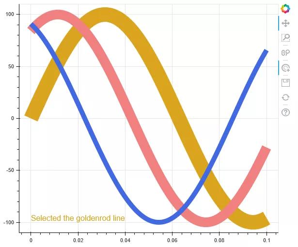
▲图11 代码示例⑪运行结果
代码示例⑪增加点击曲线的交互效果,第20、21、22行使用line()方法绘制3条曲线;第26行定义曲线再次被点击时的效果:图11中左下方会动态显示当前选中的是哪条颜色的曲线。
代码示例⑫
1import numpy as np
2from bokeh.models import ColumnDataSource, Plot, LinearAxis, Grid
3from bokeh.models.glyphs import Line
4# 数据
5N = 30
6x = np.linspace(-2. 2. N)
7y = x**2
8source = ColumnDataSource(dict(x=x, y=y))
9# 画布
10plot = Plot(
11 title=None, plot_width=300. plot_height=300.
12# min_border=0.
13# toolbar_location=None
14)
15# 绘图
16glyph = Line(x="x", y="y", line_color="#f46d43", line_width=6. line_alpha=0.6)
17plot.add_glyph(source, glyph)
18# x轴单独设置(默认)
19xaxis = LinearAxis()
20plot.add_layout(xaxis, 'below')
21# y轴单独设置(默认)
22yaxis = LinearAxis()
23plot.add_layout(yaxis, 'left')
24# 坐标轴刻度
25plot.add_layout(Grid(dimension=0. ticker=xaxis.ticker))
26plot.add_layout(Grid(dimension=1. ticker=yaxis.ticker))
27# 显示
28show(plot)
运行结果如图12所示。
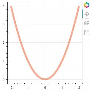
▲图12 代码示例⑫运行结果
代码示例⑫使用models接口进行曲线绘制,注意第10、17、20行的绘制方法,这种绘图方式在实践中基本很少用到,仅作了解。
本文摘编自《Python数据可视化:基于Bokeh的可视化绘图》,经出版方授权发布。
以上就是小编跟大家分享的如何用python绘制折线图的相关内容,希望对大家有所帮助。
CDA数据分析师考试相关入口一览(建议收藏):
▷ 想报名CDA认证考试,点击>>>
“CDA报名”
了解CDA考试详情;
▷ 想学习CDA考试教材,点击>>> “CDA教材” 了解CDA考试教材;
▷ 想加入CDA考试题库,点击>>> “CDA题库” 了解CDA考试题库;
▷ 想了解CDA考试含金量,点击>>> “CDA含金量” 了解CDA考试详情;
▷ 想了解CDA院校合作,点击>>> “院校合作” 了解咨询CDA院校合作;


 京公网安备 11010802034615号
经营许可证编号:京B2-20210330
京公网安备 11010802034615号
经营许可证编号:京B2-20210330