数据分析之_散点图_数据分析师
一:什么是散点图 - What is a scatter plot
任何数据分析的第一步是图形化曲线显示数据,根据相互关系,图形曲线被称为散点图。散点图可以表示两个变量之间真实的关系强度,关系的趋势,是否存在Outliers
二:散点图的目的是什么
ü 观察变量之间的关系,发现统计数据中是否存在问题,或者特殊值和感兴趣的数据
ü 数据是如何被离散化的
ü 通过眼睛观察是否存在Outliers
三:示例说明
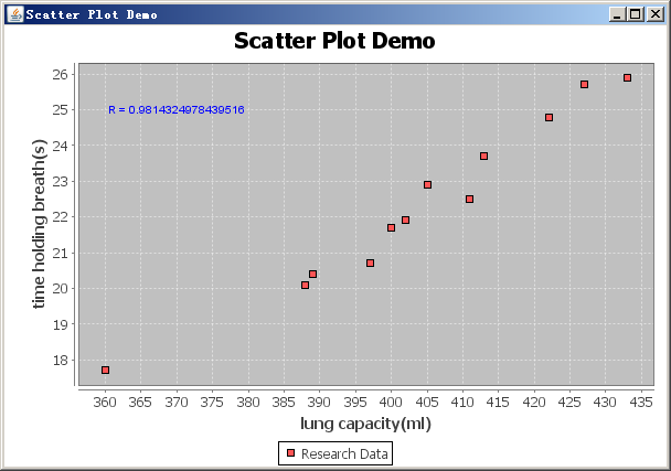
一个人的肺活量和屏住呼吸时间的研究,一个人能屏住呼吸多久,一个研究者选择一组人作为研究对象,测量每个人的肺活量作为第一个变量,屏住呼吸时间作为第二个变量,研究者将使用散点图来描述数据,假设肺活量作为水平轴,屏住呼吸时间做为垂直轴。
四:代码实现
基于Java开源的数据图形显示组件-JFreeChart已经实现了离散图,只要我们提供数据即可
基于上面描述的演示如下:
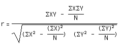
五:相关性系数 correlation coefficient – R/r
|
Relationship Between X and Y Axis
|
|
r = + 1.0
|
Strong - Positive
|
As X goes up, Y always also goes up
|
|
r = + 0.5
|
Weak - Positive
|
As X goes up, Y tends to usually also go up
|
|
r = 0
|
- No Correlation -
|
X and Y are not correlated
|
|
r = - 0.5
|
Weak - Negative
|
As X goes up, Y tends to usually go down
|
|
r = - 1.0
|
Strong - Negative
|
As X goes up, Y always goes down
|
本例中的r值为0.9814324978439516,显然肺活量跟屏住呼吸时间长短有很强的正相关性。
以下为源代码:
package com.dataanalysis.plots; import java.awt.Color; import javax.swing.JPanel; import org.apache.commons.math.stat.descriptive.DescriptiveStatistics; import org.jfree.chart.ChartFactory; import org.jfree.chart.ChartPanel; import org.jfree.chart.JFreeChart; import org.jfree.chart.annotations.XYTextAnnotation; import org.jfree.chart.axis.NumberAxis; import org.jfree.chart.plot.PlotOrientation; import org.jfree.chart.plot.XYPlot; import org.jfree.chart.renderer.xy.XYLineAndShapeRenderer; import org.jfree.data.xy.DefaultXYDataset; import org.jfree.data.xy.XYDataset; import org.jfree.ui.ApplicationFrame; import org.jfree.ui.RefineryUtilities; // - http://en.wikipedia.org/wiki/Scatter_plot public class ScatterPlotDemo extends ApplicationFrame { /** * */ private static final long serialVersionUID = 1L; private static double[][] data; /** * A demonstration application showing a scatter plot. * * @param title the frame title. */ public ScatterPlotDemo(String title) { super(title); JPanel chartPanel = createDemoPanel(); chartPanel.setPreferredSize(new java.awt.Dimension(600, 400)); setContentPane(chartPanel); } private static JFreeChart createChart(XYDataset dataset) { JFreeChart chart = ChartFactory.createScatterPlot("Scatter Plot Demo", "lung capacity(ml)", "time holding breath(s)", dataset, PlotOrientation.VERTICAL, true, false, false); XYPlot plot = (XYPlot) chart.getPlot(); plot.setNoDataMessage("NO DATA"); plot.setDomainZeroBaselineVisible(true); plot.setRangeZeroBaselineVisible(true); XYLineAndShapeRenderer renderer = (XYLineAndShapeRenderer) plot.getRenderer(); renderer.setSeriesOutlinePaint(0, Color.black); renderer.setUseOutlinePaint(true); // x axis NumberAxis domainAxis = (NumberAxis) plot.getDomainAxis(); domainAxis.setAutoRange(true); // Y axis NumberAxis rangeAxis = (NumberAxis) plot.getRangeAxis(); rangeAxis.setAutoRange(true); XYTextAnnotation textAnnotation = new XYTextAnnotation("R = " + calculateCoefficient(data), 370, 25); // r value textAnnotation.setPaint(Color.BLUE); textAnnotation.setToolTipText("Correlation Coefficient"); plot.addAnnotation(textAnnotation); return chart; } /** * Creates a panel for the demo (used by SuperDemo.java). * * @return A panel. */ public static JPanel createDemoPanel() { JFreeChart chart = createChart(createXYDataset()); ChartPanel chartPanel = new ChartPanel(chart); chartPanel.setPopupMenu(null); chartPanel.setDomainZoomable(true); chartPanel.setRangeZoomable(true); return chartPanel; } public static XYDataset createXYDataset() { DefaultXYDataset xyDataset = new DefaultXYDataset(); data = new double[2][12]; // x axis data - lung capacity(ml) data[0] = new double[]{400,397,360,402,413,427,389,388,405,422,411,433}; // y axis data - time holding breath(s) data[1] = new double[]{21.7,20.7,17.7,21.9,23.7,25.7,20.4,20.1,22.9,24.8,22.5,25.9}; xyDataset.addSeries("Research Data", data); System.out.println("Correlation Coefficient = " + calculateCoefficient(data)); return xyDataset; } public static double calculateCoefficient(double[][] data) { DescriptiveStatistics xDataSet = new DescriptiveStatistics(); for(int i=0; i<data[0].length; i="" xdataset="" descriptivestatistics="" ydataset="new" descriptivestatistics="" for="" i="0;" i="" i="" ydataset="" double="" n="yDataSet.getValues().length;" double="" xysum="0.0d;" double="" xpowsum="0.0d;" double="" ypowsum="0.0d;" for="" i="0;" i="" i="" xysum="" xdataset="" ydataset="" xpowsum="" math="" ypowsum="" double="" s1="xySum" -="" ydataset="" double="" xs="xPowSum" -="" double="" ys="yPowSum" -="" double="" s2="Math.sqrt(xS" ys="" return="" s2="" starting="" point="" for="" the="" demonstration="" application="" args="" ignored="" public="" static="" void="" main="" args="" scatterplotdemo="" demo="new" scatterplotdemo="" plot="" demo="" demo="" refineryutilities="" demo=""> </data[0].length;>
CDA数据分析师考试相关入口一览(建议收藏):
▷ 想报名CDA认证考试,点击>>>
“CDA报名”
了解CDA考试详情;
▷ 想学习CDA考试教材,点击>>> “CDA教材” 了解CDA考试教材;
▷ 想加入CDA考试题库,点击>>> “CDA题库” 了解CDA考试题库;
▷ 想了解CDA考试含金量,点击>>> “CDA含金量” 了解CDA考试详情;
▷ 想了解CDA院校合作,点击>>> “院校合作” 了解咨询CDA院校合作;


 京公网安备 11010802034615号
经营许可证编号:京B2-20210330
京公网安备 11010802034615号
经营许可证编号:京B2-20210330