Python+matplotlib绘制不同大小和颜色散点图实例
这篇文章主要介绍了Python+matplotlib绘制不同大小和颜色散点图实例,matplotlib的用法是比较多种多样的,下面一起看看其中的一个实例吧
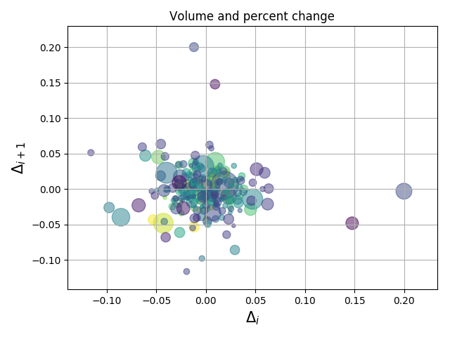
具有不同标记颜色和大小的散点图演示。
演示结果:
实现代码:
import numpy as np
import matplotlib.pyplot as plt
import matplotlib.cbook as cbook
# Load a numpy record array from yahoo csv data with fields date, open, close,
# volume, adj_close from the mpl-data/example directory. The record array
# stores the date as an np.datetime64 with a day unit ('D') in the date column.
with cbook.get_sample_data('goog.npz') as datafile:
price_data = np.load(datafile)['price_data'].view(np.recarray)
price_data = price_data[-250:] # get the most recent 250 trading days
delta1 = np.diff(price_data.adj_close) / price_data.adj_close[:-1]
# Marker size in units of points^2
volume = (15 * price_data.volume[:-2] / price_data.volume[0])**2
close = 0.003 * price_data.close[:-2] / 0.003 * price_data.open[:-2]
fig, ax = plt.subplots()
ax.scatter(delta1[:-1], delta1[1:], c=close, s=volume, alpha=0.5)
ax.set_xlabel(r'$\Delta_i$', fontsize=15)
ax.set_ylabel(r'$\Delta_{i+1}$', fontsize=15)
ax.set_title('Volume and percent change')
ax.grid(True)
fig.tight_layout()
plt.show()
总结
以上就是本文关于Python+matplotlib绘制不同大小和颜色散点图实例的全部内容,希望对大家有所帮助。
CDA数据分析师考试相关入口一览(建议收藏):
▷ 想报名CDA认证考试,点击>>>
“CDA报名”
了解CDA考试详情;
▷ 想学习CDA考试教材,点击>>> “CDA教材” 了解CDA考试教材;
▷ 想加入CDA考试题库,点击>>> “CDA题库” 了解CDA考试题库;
▷ 想了解CDA考试含金量,点击>>> “CDA含金量” 了解CDA考试详情;
▷ 想了解CDA院校合作,点击>>> “院校合作” 了解咨询CDA院校合作;


 京公网安备 11010802034615号
经营许可证编号:京B2-20210330
京公网安备 11010802034615号
经营许可证编号:京B2-20210330