来源:AI入门学习
作者:伍正祥
一、名称怎么来的
在克里米亚战争期间,南丁格尔发现战地医院的卫生条件恶劣导致很多士兵死亡。因此,她开始研究伤员的死亡和卫生环境的关系,并试图用统计数据说服维多利亚女王改善军事医院的卫生条件。但是她也担心,女王那么忙,没有时间看她那厚厚的报告和那些复杂的表格数据。于是,她设计了上面的这个生动又有趣的图表,巧妙的展示了部队医院季节性的死亡率。她自己给它取名叫鸡冠花图(coxcomb)。
我们先来看看最早的南丁格尔玫瑰图展示了什么样的数据。这张图展示的是1854年4月到1855年3月这一年间士兵的死亡情况。其中:
1)绿色表示死于可预防疾病的士兵人数;
2)红色表示死于枪伤的人数;
3)黑色表示死于其他意外的人数。
从图中可以看出,在这一年间,死亡人数最多的并不是在战争中受枪伤(红色部分),大部分的士兵是死于可预防疾病(绿色部分),特别是冬天的时候(1854年11月-1855年2月),死于可预防疾病的士兵人数大幅增加。这也反映出医院的卫生条件、保暖对于伤员的康复是多么的重要。因此,才说服了女王大人改善医院条件。
这么有气质的图表,我们来看看经过这么多年的发展,大家都是怎么用的。尽管外形很像饼图,但本质上来说,南丁格尔玫瑰图更像在极坐标下绘制的柱状图或堆叠柱状图。只不过,它用半径来反映数值(而饼图是以扇形的弧度来表示数据的)。但是,由于半径和面积之间是平方的关系,视觉上,南丁格尔玫瑰图会将数据的比例夸大。因此,当我们追求数据的准确性时,玫瑰图不一定是个好的选择。但反过来说,当我们需要对比非常相近的数值时,适当的夸大会有助于分辨。
1. Facebook 和 twitter的用户对比
1)图表中包括性别、年龄、教育、收入等11个分类的对比信息指标,每个指标占用的圆周的角度相同,即任一指标的扇区角度为(360/11=32.723度)。
2)在“Gender”,“Income”,“Age”,“Education”四个指标中,又被分别划成几个不同的区段。
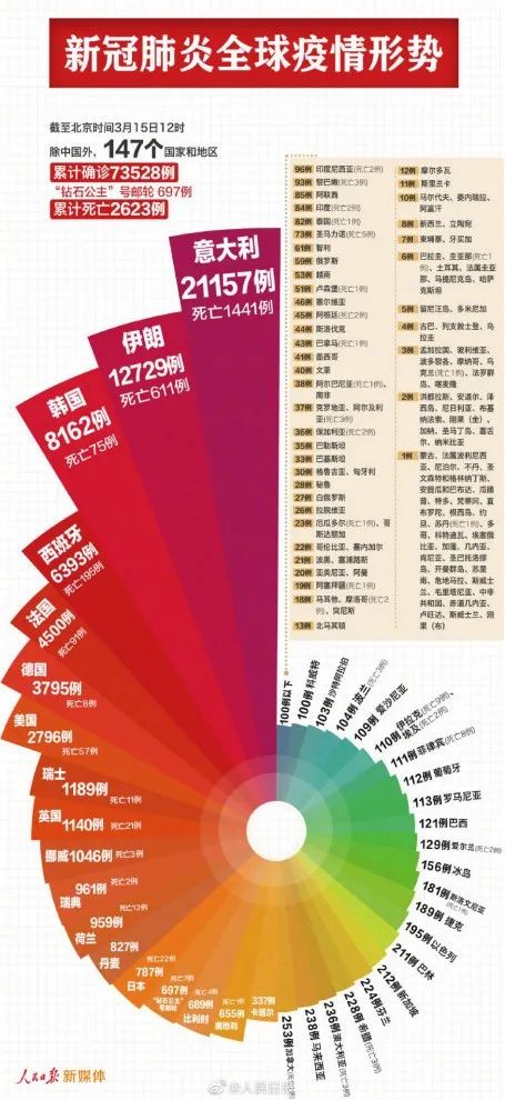
2、新冠肺炎全球疫情形势
案例1:facebook数据
直接使用上面facebook的数据,关注公众号AI入门学习回复【facebook】获取csv文件,用R语言画个示例,数据格式需要长格式,如下: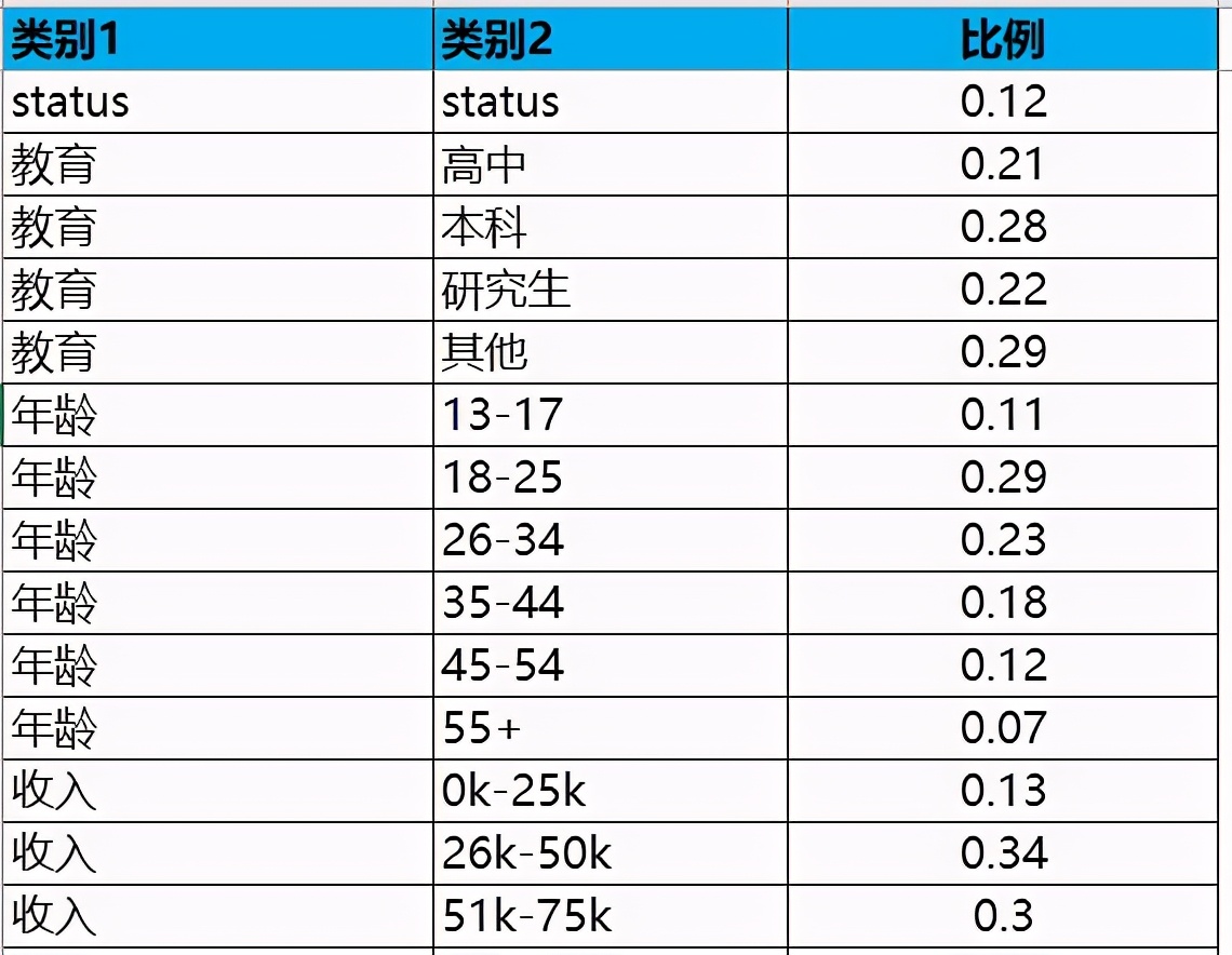
#facebooks数据 library(ggplot2)
facebook = read.csv("facebook.csv",header=T,stringsAsFactors = FALSE)
ggplot(facebook, aes(x = 类别1,y=比例,fill = 类别2)) +
geom_bar(alpha = 0.93,stat="identity") +
coord_polar()+
theme_bw()+
theme(panel.background = element_rect(fill = "black"))+
theme(axis.text = element_blank())+
theme(axis.ticks = element_blank())+# 去掉左上角的刻度线 theme(axis.title = element_blank())+
theme(legend.position = 'none')+# 去掉图例 theme(panel.border = element_blank())+# 去掉外层边框
theme(panel.background = element_rect(fill = "black"))+ #黑色背景 theme(panel.grid.major.x = element_line(colour =
"SpringGreen2", size = 0.3))+ #网格线设置 theme(panel.grid.major.y =
 element_line(colour = "SpringGreen2", size = 0.3))+ #网格线设置   ylim(-0.3,1.1)+
scale_fill_discrete(c=1000, l=100)
ggsave('rose.png',dpi = 1080)#保存为高清格式,dpi越大越清晰
图形如下,可以根据个人喜好对颜色进行切换,当然,各种标注,可以在PPT中完成,多个对比的,也可以在PPT中进行拼接。
用R自带数据集画一个不带网格线的
dsmall = diamonds[sample(nrow(diamonds),5000),]
ggplot(dsmall, aes(x = clarity,  fill = cut)) +
geom_bar(alpha = 0.85) +
coord_polar() +
theme_bw() +
theme(panel.background = element_rect(fill = "black"))+
theme(axis.text = element_blank())+
theme(axis.ticks = element_blank())+# 去掉左上角的刻度线 theme(axis.title = element_blank())+
theme(legend.position = 'none')+# 去掉图例 theme(panel.border = element_blank())+# 去掉外层边框
theme(panel.background = element_rect(fill = "black"))+ #黑色背景 theme(panel.grid=element_blank())+
ylim(-50,1000)+
scale_fill_manual(values = alpha(c("DarkOrchid1",  "SpringGreen", "Magenta","Cyan","OrangeRed1")))
ggsave('rose.png',dpi = 1080)

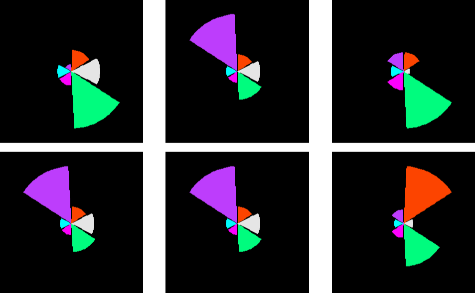
案例2:多图组合
首先,介绍个函数,多个图组合到一起的
multiplot <- function(..., plotlist=NULL, file, cols=1, layout=NULL) {
      library(grid)
      plots <- c(list(...), plotlist)
      numPlots = length(plots)
      if (is.null(layout)) {
        layout <- matrix(seq(1, cols * ceiling(numPlots/cols)),
                         ncol = cols, nrow = ceiling(numPlots/cols))
      }

     if (numPlots==1) {
        print(plots[[1]])
      } else {
        grid.newpage()
        pushViewport(viewport(layout = grid.layout(nrow(layout), ncol(layout))))
        for (i in 1:numPlots) {
          matchidx <- as.data.frame(which(layout == i, arr.ind = TRUE))
          print(plots[[i]], vp = viewport(layout.pos.row = matchidx$row,
                                          layout.pos.col = matchidx$col))
        }
      }
    }
开始绘图部分,下六组数据替换分别跑一次,得到 p1,p2,p3,p4,p5,p6,然后用上面定义的函数组合即可
par(mar=c(0,0,0,0)) #c(4,3,8,2,2,1) #c(4,3,5,2,2,10) #c(15,3,5,8,2,8) #c(1,3,5,3,2,8)
 #c(1,3,9,3,2,3) #c(2,12,9,3,2,3) data = data.frame(value= c(2,12,9,3,2,3), type = c('B','A','C','D','E',F))
p1 =
ggplot(data, aes(x =type, y=value, fill=type)) +
geom_bar(stat = "identity", alpha = 0.99) +
coord_polar() +
theme_bw() +
theme(panel.background = element_rect(fill = "black"))+
theme(axis.text = element_blank())+
theme(axis.ticks = element_blank())+# 去掉左上角的刻度线 theme(axis.title = element_blank())+
theme(legend.position = 'none')+# 去掉图例 theme(panel.border = element_blank())+# 去掉外层边框 theme(panel.background =
element_rect(fill = "black"))+ #黑色背景 theme(panel.grid=element_blank())+
scale_fill_manual(values = alpha(c("OrangeRed1", 'gray91',"SpringGreen", "Magenta","Cyan", "DarkOrchid1")))
multiplot(p1,p2,p3,p4,p5,p6,cols=3)
结果如下:
重新替换一批数据得到下图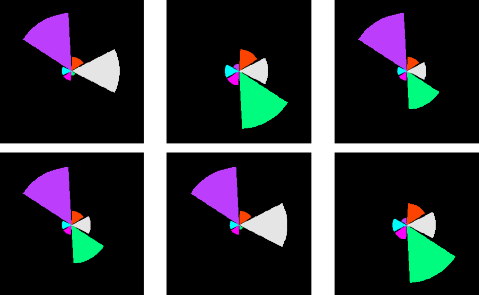
CDA数据分析师考试相关入口一览(建议收藏):
▷ 想报名CDA认证考试,点击>>>
“CDA报名”
了解CDA考试详情;
▷ 想学习CDA考试教材,点击>>> “CDA教材” 了解CDA考试教材;
▷ 想加入CDA考试题库,点击>>> “CDA题库” 了解CDA考试题库;
▷ 想了解CDA考试含金量,点击>>> “CDA含金量” 了解CDA考试详情;
▷ 想了解CDA院校合作,点击>>> “院校合作” 了解咨询CDA院校合作;


 京公网安备 11010802034615号
经营许可证编号:京B2-20210330
京公网安备 11010802034615号
经营许可证编号:京B2-20210330